Google Chrome – first impressions +
Just a quick braindump of my first impressions using Google Chrome.
Download and install went smoothly. It tried importing Firefox settings, but required closing all Firefox instances to do so. So I skipped the import through a dialog or two.
The installer automatically set all the language and regional settings to Croatian. Since croatian interface freaks me out, that had to be changed. The wrench icon is your friend here.
The UI is spiffy and smooth. Transitions occur (try pressing “ctrl + b”, show/hide the bookmarks bar). It’s probably a safe bet it’ll be skinnable at least to some extent.
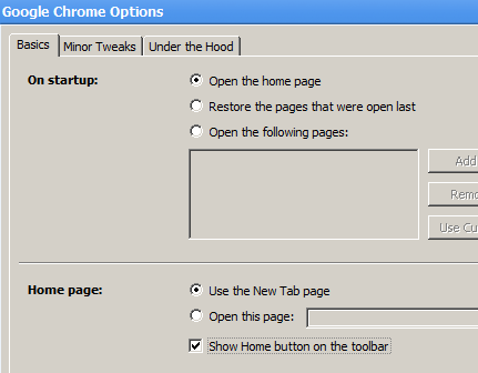
The home button is hidden by default. Wierd. A trip to the options menu and that’s fixed:

The home page is obviously going to be able to integrate google gadgets at some point. If it’s not already available…
I don’t see any “feed indicators” for pages that have RSS autodiscovery enabled. That sucks. No integrated feed reader either…
Navigating to an RSS or XML feed produces raw unstyled feed contents. I’m suspecting Google Reader integration (or something to that effect) is in the works…
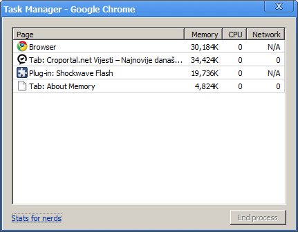
Once you start the app, two chrome.exe processes spawn, I’m guessing one is the master, and the other one is responsible for handling your first open tab. As soon as you type in an address, a third process spawns. Which is sweet, you can check each site’s memory usage separately, and this is gonna be useful.
If you maximize the chrome window, the small google logo (which is otherwise placed right next to the min/max/close window controls) disappears, and the window bar shrinks a bit vertically.
Flash works. Cool.
Something is fishy with it, though. Noticing CPU usage spikes when hovering over flash content, gotta test more. Preliminary tests show it might be wmode=”transparent” related…
Since it’s based on Webkit, all the developer goodies are there: js debugger, dom inspector, resource inspector etc.)
Umm… double click on the window title bar maximizes the window. That’s expected. The problem is in my developed habit of double clicking right next to the current tab to create a new empty one.
“Ctrl + t” keyboard shortcut works out of the box though.
The way that the domain name is differently colored is cool:

And the https:// red thingy on invalid or non-trusted certificates is also nice:

The task manager (Shift + esc) shows highly useful stuff:

With a much detailed breakdown of memory usage available — either click “stats for nerds” in the lower left corner of the task manager, or type in “about:memory” in the address bar.
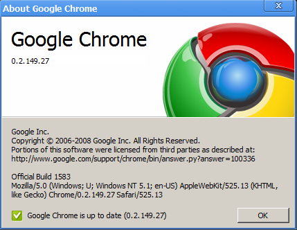
The About window reveals the User-Agent string, and also automatically checks for updates:

All in all, it looks & feels promising. A definite sign of interesting times ahead for everyone involved.